Credibility

Standard

Q1) Credibility is one of the attributes that we use to evaluate information on the web, we also consider trustworthiness and the expertise of material to create a negative or positive conclusion of believability. For something to be credible we must perceive and evaluate a website “traditional media and online search engines are the most trusted forms of media” (Frasco, 2014) information must be consistent, believable, look professional and have reputable and legitimate sources for readers to gain trust and truth in websites. “the most credible resources are those that have high levels of trustworthiness and expertise” (Fogg, 2003) When reading online sources, we first determine that they are trustworthy by their morality, truthful and unbiased content. If they are trustworthy , then they are more likely to have expertise. Expertise is “Knowledge, skill and experience” (Fogg, 2003) in the particular field.”Interactivity and navigation influence credibility judgements by triggering cognitive heuristics” (Metzger, Lanagin, 2008). Credibility will affect me as a student as I am constantly searching for information during research for assignments and when scanning documents at speed we can often forgo credibility. With the increase of technology we often scan information and instantly believe it as we are becoming more accustomed to colloquial ways of communicating “questions are important for understanding credibility in a digital age […] member comments, blog styles and outlandish claims question the credibility of online news” (McCombs, Holbert, Kiousis, Wanta, 2011)


Fogg, B.J. (2003) Credibility and the World Wide Web.Persuasive Technology: Using Computers to Change What We Think and Do Retrieved from http://my.safaribooksonline.com/book/digital-media/9781558606432/chapter-7-credibility-and-the-world-wide-web/chapter_7_credibility_and_the#X2ludGVybmFsX0J2ZGVwRmxhc2hSZWFkZXI/eG1saWQ9OTc4MTU1ODYwNjQzMi8xNDk=

Frasco, S. (2014) 5 Ways to Build Online Credibility Social Media Today. Retrieved from http://socialmediatoday.com/stephaniefrasco/2150136/5-ways-build-online-credibility

McCombs, M. Holbert, L. Kiousis, S. Wanta, W. (2011) The News and Public Opinion Media Affects on Digital Life. doi: 978.0.7456.4518.6

Metzer, M. Lanagin, A. (2008) Digital Media, Youth and Credibility. doi: 978.0.262.06273.2


Q2) For this learning portfolio, Wikipedia is not accepted as a credible source of information. My reasoning for this is that Wikipedia has the ability to be edited by anyone at any time, therefore un-sourced information can be added and may contain “linking to other sites that are not credible” (Fogg, 2003) it does not contain “awards, approval links or endorsements […] does not list a physical address and phone number” (Fogg, 2003) it also not note cite the authors which questions its credibility “a web site will have more credibility of it highlights the people or organisation behind the content” (Fogg, 2003) Wikipedia is untrustworthy as from reading its own disclaimer that information is “contributed by anyone who wants to post material, the expertise is not taken into consideration” (Harvard, 2013) also some information can be out-dated and written very colloquially in a ‘blog style’ “people who viewed sites with outdated content as lacking in credibility” (Fogg, 2003) Wikipedia does not feature three of the four types of web credibility either, Reputed  – It has not won any awards or recognition for its content, Surface – it does not look professionally designed, and Earned – it has not produced accurate information over the past year.

Fogg, B.J. (2003) Credibility and the World Wide Web.Persuasive Technology: Using Computers to Change What We Think and Do Retrieved from http://my.safaribooksonline.com/book/digital-media/9781558606432/chapter-7-credibility-and-the-world-wide-web/chapter_7_credibility_and_the#X2ludGVybmFsX0J2ZGVwRmxhc2hSZWFkZXI/eG1saWQ9OTc4MTU1ODYwNjQzMi8xNDk=

Harvard (2013) What’s Wrong with Wikipedia Harvard Guide to Using Sources Retrieved from http://usingsources.fas.harvard.edu/icb/icb.do?keyword=k70847&pageid=icb.page346376


Q3) Anticipated issues that may affect the users’ perceived web credibility in the future:

  • The lack of Google Mapping to locate companies
  • Lack of links to social media, Facebook and Twitter sites
  • The limited availability to purchase items online
  • Less trustworthy and in depth content, we increase our time spent online, we become more sceptical
  • No globalisation of information as we move around the world information must be compatible globally
  • Limited accessibility of websites on different media devices, a mobile layout, tablet layout etc
  • The content needs to be constantly updated as we access the internet more and more
  • Must have touch points in websites, everything is interactional as we become a more human-centred digital world
  • Lack of legible sources and legitimate authors, create a scanning system to verify information
  • Lack of student and children orientated websites with understandable information
  • Lack of restrictions on who can set up websites, non-for profit sites will clutter information searches
  • Lack of hyperlinked sources to check verification, Lack of interaction and navigation with the content
  • Lack of background information about Authors means we do not know their qualifications or rights to writing content

A1) 

screen  1

Presumed – A domain name that ends in .org

Reputed - A site that has been featured and awarded in magazines

Reputed – A site that has been featured and awarded in magazines

Surface - A site that looks professionally designed

Surface – A site that looks professionally designed

Earned - A site that consistently provides accurate information

Earned – A site that consistently provides accurate information

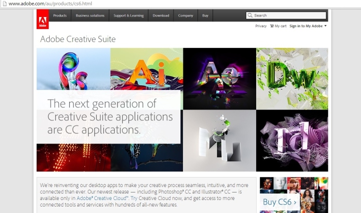
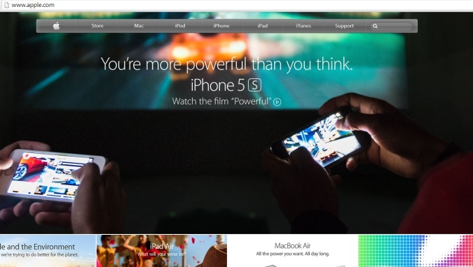
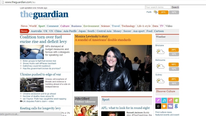
These four sites that I have sourced represent the four types of Web Credibility. Unicef.org is a presumed site, which is based in general consumptions that it is a legitimate company and is credible, trustworthy and has expertise. The Adobe website is a Reputed site, which means it has been featured in many PC magazines, online articles and is the recommended place to download software. The Apple.com website represents Surface. This means it looks professional, sleek and cleverly designed but being easy to interact with. And finally the Earned website is The Guardian Newspaper which I visit everyday and see updated articles with current information

Performance Loads

Standard

Q1) we have learnt concepts and automated reactions that we use in everyday tasks where actions require little cognitive loading in our busy lifestyles. We enjoy achieving simple tasks “a learner should be encouraged to use his/ her limited working memory efficiently” (Sweller, 2006) an example of this is brushing your teeth, an everyday task which  has a low performance loading therefore is completed with ease. More complicated tasks such as learning a computer program “without the appropriate instruction,it may easily impose a high burden on the cognitive system of the leaner” (Gary, Morrison, 2011) need to be precise and instructional. Kinematic loading is constantly being refined to make tasks physically quicker, for example a Nespresso Coffee machine makes a coffee in under 2 minutes, when compared with old-fashioned physical bean grinding, filtering and milk warming. The physical steps are reduced with the invention of ‘coffee pods’ which are inserted into the machine at ease. “they’re consistent, cheaper than hiring a barista, and take up less space than a traditional espresso machine” (Salter, 2013). Ikea furniture has a large Kinematic loading, as all products come flat-packed and require physical assembly through a series of instructions. “The flat pack plays an important role in IKEA’s pricing strategy […] promoting efficiency of inventory” (Das,Debnath et al., 2010)


Das, V. Debnath, N. Stephen, J et al. (2010) Information Processing and Management Communications in Computer and Information Science. doi: 978.3.642.12213.2

Kalman, H. Kemp, J. Morrison, G. Ross, S (2011) Designing Effective Instruction. doi: 978.0.470.52282.0

Salter, K. (2013) The Rise of the Coffee Pod Machines The Guardian. Retrieved from http://www.theguardian.com/lifeandstyle/wordofmouth/2013/apr/10/rise-coffee-pod-machines-nespresso

Sweller, J. (2006) Cognitive Load Theory. Online Learning Laboratory. Retrieved from http://www.southalabama.edu/oll/mobile/theory_workbook/cognitive_load_theory.htm


Q2) To reduce Cognitive Load we can apply a design technique called Chunking, this involves grouping information into meaningful and easy-to-process chunks.”the chunks need to represent something meaningful […] we intend chunking to help the leaner build and add to the schema” (Bozarth, 2010) this can be applied to both information, instructions and designs. Chunking in Designs involves the meaningful use of white space and informative images to help support the material, Therefore reduces the unnecessary clutter that could confuse consumers. It is said that the ‘chunks’ should be to a value of 7, give or take 2. Meaning chunks between 5 and 9 is the maximum amount the working memory can understand before confusion sets in. “When multiple elements of information are ‘chunked’ as single elements, there is more working capacity available for solving problems” (Malamed, 2012) An example of chunking is learning to drive a car, there are important chronological steps to take and these can be simplified in order to be understood. In design, chunking can be assigning meaning to objects “ascribing meaning to symbols […] to replace large amounts of environmental data with a reduced number of visual units” (Motloch, 2001) Using graphs, images, facial expressions and photographs in design can summarise what needs to be said in a paragraph in just one image. “For example, people can remember a list of 5 words for 30 seconds, but few can remember a list of 10 words for 30 seconds” (Lidwell, Holden, Butler, 2003)  Designs such as E-Learning applications, where the learner must memorise information, is ideal for chunking. Computer Interfaces and programmes need to be simplistic and informative.


Bozarth, J. (2010) Nuts and Bolts: Brain Bandwidth – Cognitive Load Theory and Instructional Design Learning Solutions Magazine Retrieved from http://www.learningsolutionsmag.com/articles/498/nuts-and-bolts-brain-bandwidth—cognitive-load-theory-and-instructional-design

Lidwell, W. Holden, K. Butler, J. (2003) Perfomace Load Universal Principles of Design (pp. 40-41) Retrieved from http://books.google.com.au/books?id=3RFyaF7jCZsC&pg=PA178&dq=cognitive+chunking+design&hl=en&sa=X&ei=HVFrU6jqD8jFkwWJ4YDYAg&ved=0CFIQ6AEwBQ#v=onepage&q=chunking&f=false

Malamed, C. (2012) What is Cognitive Load? The eLearning Coach Retrieved from http://theelearningcoach.com/learning/what-is-cognitive-load/

Motloch, J. (2001) Introduction to Landscape Design. doi: 0.471.35291.8

Q3) the use of psychology in design is very important as this helps the brain to understand theory and process information “People tend to organise visuals into groups, the whole is greater than the parts” (Taylor, 2013) By reading clear, concise, simple information this gives a psychological effect of understanding and rigidity allowing it to be understood in memory. “The brain self organises information in a manner that’s orderly” (Taylor, 2013) contrasting colours, the use of white, black and bold effects with simplistic information allows the brain to understand and process the meaning of information. “attention, memory and problem solving is affected by the absence of relevant stimulation” (Cherry, n.d) by chunking information along with relevant graphics it helps improve the “mental process of how people think, perceive,remember and learn” (Cherry, n.d)


Cherry, K. (n.d) What is Cognitive Psychology? About.com Retrieved from http://psychology.about.com/od/cognitivepsychology/f/cogpsych.htm

Taylor, A. (2013) The Psychology of Design Explained Digital Arts Retrieved from http://www.digitalartsonline.co.uk/features/graphic-design/psychology-of-design-explained/

A1)

Windows Homescreen – Cognitive Loading

Automatic Gearbox – Cognitive Loading

Ikea Flat Pack – Kinetic Loading

these 3 everyday items represent Cognitive Loading and Kinetic Loading in design. the Windows Homescreen represents Cognitive Loading, as it has a simple user interface, with the well-recognised start menu button, the trash can and desktop icons. The familiarity of these means we do not need to exert strenuous thinking to understand how to interact with this interface. Each element has been ‘chunked’ and each has its associated schemas that we all understand well. The Automatic Gearbox represents both Cognitive and Kinetic loading, its Cognitive load has minimal amount of mental activity when compared to a manual gearbox, there is no manual gear changes and therefore a smaller memory capacity is needed to operate it. Its Kinetic loading has minimal degree of physical activity to change gears and fewer number of steps to operate. The IKEA flat pack furniture is an example of Kinetic Loading. This has a high degree of physical activity and requires manual labour to assemble furniture with tools. IKEA have chosen to increase the Kinetic Loading in favour of lowering their prices and convenient shopping and transporting.

Consistency

Standard

Q1) Consistency in aesthetic and functional design is vitally important as it gives reassurance and confidence  to the user that they have strong skills to interact and enjoy with a product. “the heritage of a design or brand makes it easily identifiable to anyone who has seen that brand before. It is a very powerful thing for brands to do” (Barry, 2012) In my opinion having consistency is a very important thing in Aesthetics and functional designs, it gives the user instant recognition of actions and thoughts when seeing consistent items, we develop internal rules, actions and perceptions which make us do automated reactions. “Coherance and consistency are indispensable in our quest in our quest for understanding and prediction” (Ajzen, 2005) we recognise good quality designs by their repetition of important elements, such as reapeating colours, logo’s and repeating actions such as colours or sounds. “Consitency also creates implied meaning for users so that they can be transparently guided by hierarchy […] a cornerstone of good design” (DiMarco, 2010) having functional consistency means users can user their learnt skills to immediately interact with a product and be confident in their functions, a malfunctioning product that is not consistent immediately indicates that the product is faulty. Internal consistency can be found within organisations for recognition and reputation, this can be with companies such as Microsoft and Apple, where company colours and symbols are used to identify themselves and build reputation. “For most consumers, Microsoft is ubiquitous with not alternative to Windows or Office, and hence a utilitarian essentiality” (Baxi, 2014)  immediately if we see the Windows Start-Up menu, the four-square coloured symbol or the menu bar we immediately recognise its Microsoft and we remember learnt skills that help us navigate around their products. This brings about emotional expectations such as trust, reliability, functionality and competency.


Azjen, I. (2005) Attitudes, Personality and Behaviour  Retrieved from  http://books.google.com.au/books?id=dmJ9EGEy0ZYC&pg=PA26&dq=functional+consistency&hl=en&sa=X&ei=PehmU6jtHsf2lAWolYC4CQ&ved=0CC0Q6AEwAA#v=onepage&q=functional%20consistency&f=false

Barry, N. (2012) What is Aesthetic, Functional, Internal, External: Consistency? WordPress Retrieved from http://neillbarry.wordpress.com/2012/05/21/aesthetic-consistency-functional-consistency-internal-consistency-external-consistency/

Baxi, A. (2014) Microsoft takes the top spot in a brand survey by Forrester Mobile Nations Retrieved from http://www.wpcentral.com/microsoft-takes-top-spot-brand-survey-forrester-research

DiMarco, J. (2010) Digital Design for Print and Web: An Introduction to Theory, Principles and Techniques. doi: 978.0.470.39836.4

Q2)

Coca-Cola Aesthetic Consistency

Woolworths Internal Consistency

Functional Consistency – Keypad

These three items all feature the principle of Aesthetic Consistency, whether visual consistency, functional consistency or internal consistency. Coca-Cola features Aesthetic consistency, where the brand image, colours and format are instantly recognisable. This brings about connotations of brand trustworthiness, reliability and taste expectations. “make a set of guidelines that would unify  the brands expression and allow for seasonal and promotional variations […] visual guidlines designed for Coca-Cola, Coca-Cola Light, Coca-Cola Zero etc” (LOOP, n.d)  Woolworths Supermarket have incorporated Internal Consistency, with branding, colour scheme, images and font type which shows that Woolworths have an internal niche that represents their business. “Working with Woolworths supermarket to articulate the vision. redesign of their catchy logo and typeface and develop a brand strategy that was indicative of Woolworths’ value and beliefs” (Hulsbosch, 2012) Once inside Woolworths their branding is consistent, with the use of a green red and white, signage and typeface are kept within the store to keep the professional feel. The functional consistency  of a mobile phone keypad is universal and by using retained existing knowledge we immediately know how to use one, what the green and red call symbols stand for and how to text on  a numeric keypad “Functional consistency improves usability and learnability to enabling people to leverage existing knowledge” (Holden, Lidwell, Butler, 2003) if this layout was to change we would immediately disguard our learnt knowledge and develop knew skills at a slower pace to re-learn from a new layout.


Holden, K. Butler, J. Lidwell, W. (2003) Universal Principles of Design Rockport. doi: 978.15925.30076

Hulsbosch, H. (2012) What it Takes to Build a Powerful Brand Dynamic Business Retrieved from  http://www.dynamicbusiness.com.au/marketing-blogs/what-it-takes-to-build-a-powerful-brand-30042012.html

LOOP (n.d) Brand Consistency leading to millions in cost reduction Loop Retrieved from http://www.loopassociates.com/projects/coca-cola-brand-consistency-leading-to-millions-in-cost-reduction/

Images

coca cola cans [image] (2012) retrieved from http://www.loopassociates.com/wp-content/uploads/2012/11/coca-cola_cans-928×522.jpg

Mobile phone [image] (n.d) retrieved from http://stockarch.com/files/11/04/mobile_phone.jpg

Woolies [image] (2009) retrieved from http://www.geek.com/wp-content/uploads/2009/10/woolies4.png 

Aesthetic Designs

Standard

Q1) Aesthetic designs are often something we take for granted in the 21st Century. We almost automatically expect a product to be comfortable, easy to use and user friendly and have an “artistically beautiful or pleasing experience” (Bradley, 2010) in my opinion I feel aesthetical elements in design have been over-processed and exaggerated to the point where objects are no longer comfortable to use. “To attempt to unpack the complexity of cultural objects” (Hill, 1999) has been misinterpreted even with simple objects such as the Apple Wireless Mouse which I find uncomfortable and does not fit comfortably into my hand which hinders everyday computer use. Other products such as the handles on a ceramic tea mug are not often comfortable for the fingers and this should be aesthetically important in an everyday object. “Although poor design is never excusable, when people are in a relaxed situation, the pleasant, pleasurable aspects of a design will make them more tolerant of dificulties and problems in the interface” (Norman, 2002) explains that in leisure activities we tend to forgo the uncomfortable aesthetics in place of the overall pleasure from such activity. On the other hand, some aesthetic designs work well into everyday life such as Computer Tablets. When compared with Desktop computers or Laptops,  tablets are user-friendly, lightweight, easy to use and have instant touch response technology. “The most streamlined aesthetics […] a little black slab that fits in your hand, with a glossy IPS screen” (Plastiras, 2014) which is revolutionary when compared to the original bulky desktops and heavy laptops which now seem inconvenient and obsolete. “Aesthetics has lost its character as a special discipline relating solely to art, it has become a more general medium” (Welsch, 1997) which supports my thesis that aesthetics has lost its touch as an appreciative form of design. More products are trying to be hyper-real and almost cartoonify their use which makes them seem overly designed for everyday use.


Bradley, S. (2010) Designing Meaningful Aesthetics Vanseo Design Retreived from http://www.vanseodesign.com/web-design/meaningful-design-aesthetics/

Hill, R. (1999) Designs and Their Consequences: Architecture and Aesthetic Retreived from http://books.google.com.au/books?id=-ooprFiVHV8C&dq=aesthetic+design+meaning&source=gbs_navlinks_s

Norman, D (2002) Emotion & Design: Attractive things work better Interactions Magazine Retreived from http://www.jnd.org/dn.mss/emotion_design_at.html

Plastiras, E. (2014) Dell Venue 8 Pro Windows 8.1 tablet PC World Business Centre Retreived from http://www.pcworld.co.nz/review/dell/venue_8_pro/538694/

Welsch, W. (1997) Undoing Aesthetics Retreived from http://books.google.com.au/books?id=J-fRmDJjLiYC&printsec=frontcover&dq=aesthetics&hl=en&sa=X&ei=PVtkU5vOE8WolAWu64DQDA&ved=0CDMQ6AEwAQ#v=onepage&q=aesthetics&f=false

Q2)

travel-neck-pillow-car-450

Memory Foam Neck Pillow

Tablet Computer.

Finger Grip Hammer

These three items, a memory foam pillow, tablet computer and hammer are all aesthetically usable with their design. They are all ergonomically designed, meaning they fit the human body in some form to be comfortable and usable. The Neck pillow is ideal for travelling, when sleeping on long journeys the neck will experience some aching and the head is not supported. Therefore the neck pillow is favoured over a normal pillow “aesthetic designs look easier to use and have a higher probability of being used” (Solomon, 1946) the pillow fits the body and supports the neck when sleeping which makes it more comfortable and favourable when travelling. The Tablet computer is aesthetically pleasing as it is small, lightweight and touch screen which means it does not need any additional accessories such as mouse, keyboard etc. The quick-response touch screen means it fits into today’s lifestyle of efficiency and modernity. People who use computer tablets are perceived to be sophisticated, modern, technology-savvy and image-conscious   “first impressions of people who influence attitude formation and measurably affect how people are perceived and treated” (Solomon, 1946) the aesthetic and ergonomic design of the Hammer looks easy and comfortable to use with its finger grip design. This can make mundane un-enjoyable tasks such as hammering screws and nails a more enjoyable task. when comparing it to an original wooden hammer, this hammer will stay gripped in the hand and give the user more confidence “people perceive more-aesthetic designs are easier to use than less aesthetic designs” (Kurosu, Kashimura, 1995) More aesthetically pleasing objects tend to be personalised as we have a more positive attitude towards them we feel  somewhat ‘connected’ to them. Stickers, colours, covers and personalisation occurs more in aesthetically pleasing designs “Such personal and positive relationships with a design evoke feelings of affection, loyalty and patience” (Norman, 2002)


Kashimura, K. Kurosu, M. (1995) Apparent Usablity vs. Inherent Usablity: Experimental Analysis on the Determinants of the Apparent Usablity Concference Companion Retrieved from http://blackboard.ecu.edu.au/bbcswebdav/pid-3078334-dt-content-rid-2730220_1/courses/CCA1108.2014.1.OFFCAMPUS/LP1.pdf

Norman, D. (2002) Emotion & Design: Attractive Things Work Better Retrieved from http://blackboard.ecu.edu.au/bbcswebdav/pid-3078334-dt-content-rid-2730220_1/courses/CCA1108.2014.1.OFFCAMPUS/LP1.pdf

Solomon, E. (1946) Forming Impressions of Personality Journal of Abnormal and Social Psychology Retrieved from http://blackboard.ecu.edu.au/bbcswebdav/pid-3078334-dt-content-rid-2730220_1/courses/CCA1108.2014.1.OFFCAMPUS/LP1.pdf

Images:

Stubbly Claw Hammer [image] (n.d) retrieved from http://ecx.images-amazon.com/images/I/61lVFOofgeL._SL1500_.jpg

Sunshine Neck Pillow [image] (n.d) retrieved from http://sunshine-pillows.com/travel-neck-pillow-images/travel-neck-pillow-car-450.jpg

Tablet Computers [image] (2012) retrieved from http://www.firsttabletpc.com/wp-content/uploads/2012/06/tablet-computers.jpg